


How My Cookbook Cover Got Made
How My Cookbook Cover Got Made
This week on Instagram, photographer Aubrie Pick posted the Ever-Green Vietnamese cover photos she shot. Things didn’t turn out the way I thought they would. Here's an explainer.

After writing half a dozen cookbooks, you’d think that I would have a handle on most things but I sorta only do. One of the hardest things to figure out is the cover. It matters for sales purposes (my name and well-tested recipes are not enough!) and my first six book covers were designed with ease. We picked the recipe, shot it, and the book designer was at the photoshoot to mock up a cover that was 85% done. Sweet.
With Ever-Green Vietnamese, we went back and forth for months. Before the intense seven-day photoshoot, my editor, Lorena Jones, and art director, Elizabeth (Betsy) Stromberg, and I discussed how to make a cover to communicate Viet cuisine’s celebration of fresh produce. Working from Betsy’s mood board and from the book’s 100 recipes, we chose:
Mango and Shrimp Rice Paper Rolls (Gỏi Cuốn Tôm Xoài) — It’s an iconic dish that’s also handsome and healthful. Who doesn’t love rice paper rolls? We’d shoot them in a scene that evoked the book’s calm, welcoming spirit.
Huế Rice Crepes (Bánh Khoái) — These are head turners. The crunchy, fried, sinfully delicious crepes are stunningly good. Made of rice flour (or soaked, blended rice), bánh khoái beautifully express Vietnamese transformations of rice.
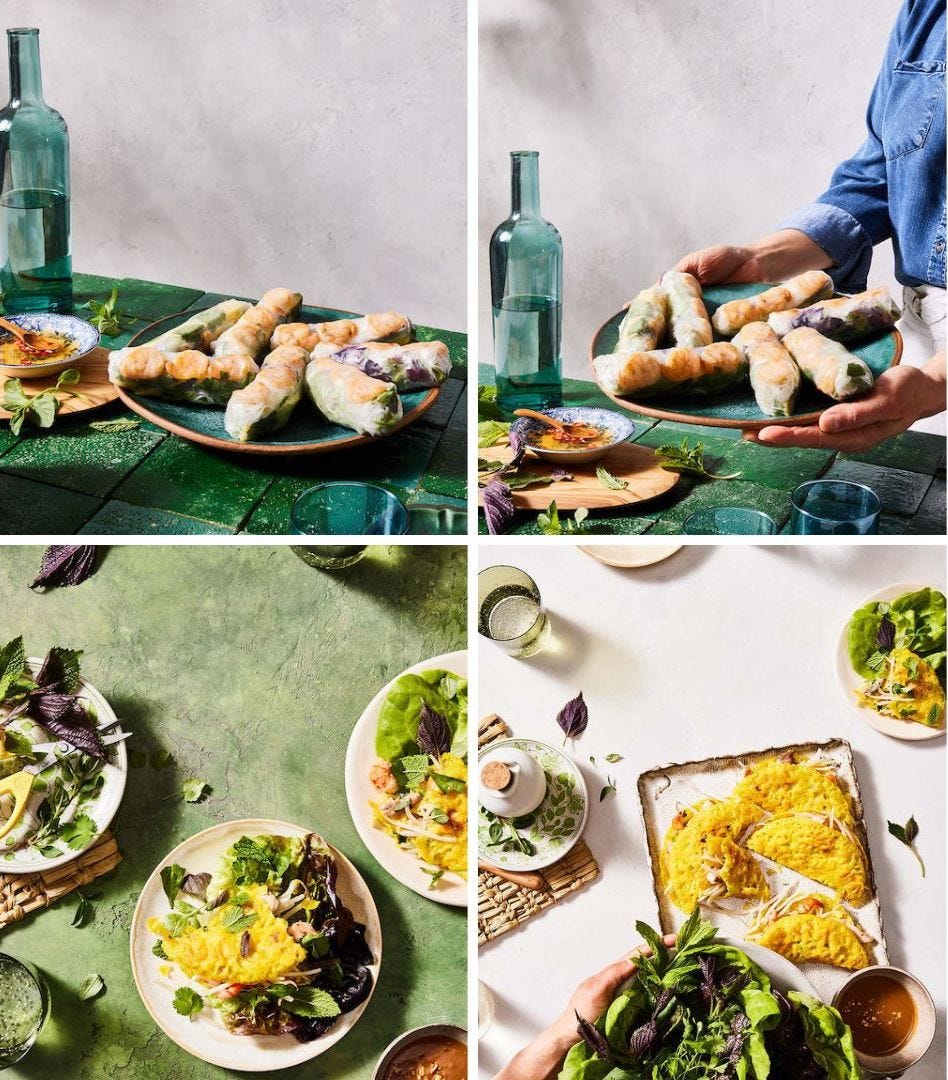
Photographer Aubrie Pick, along with food stylist, Karen Shinto, and prop stylist, Glenn Jenkins, considered various angles, plating and backgrounds. Here’s a small sampling of the shots created:
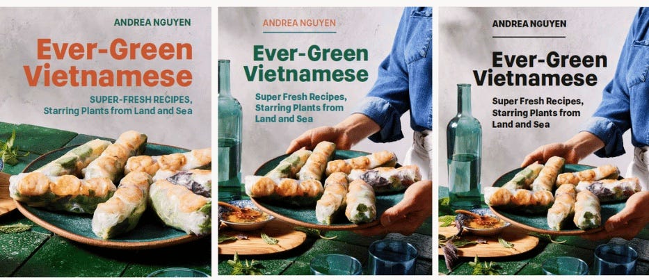
The "holes” are spaces for placing the title, subtitle, and my name.
A good food photo tells a story but keeps the focus on the food. In the top left image, the gỏi cuốn say, “Eat me in the warm sun. I am refreshing and healthy.” The photo with my hands invites readers to gather, cook, and enjoy tasty food.
The bottom left image of the crepes spotlights their crunchiness and intriguing filling; prop stylist Glenn Jenkins fabricated that background surface to reinforce the Ever-Green vibes. The bottom right photo conveys, “Be part of this fun, fresh, Vietnamese food party!”
Not All was Well in Coverland
After the shoot, as the team placed the text and we all took a few steps back, issues arose. In the draft manuscript, I described bánh khoái as “taco like” and the team (which had then expanded to include marketing and sales folks) felt that the rice crepes could be mistaken for a Vietnamese take on Mexican fried tacos.
Really? Consumers viscerally react to book covers and could get turned off, they told me. You, the author, don’t get to explain to them. The team said we don’t want to risk it. I thought about their points and in the end, the Huế rice crepes got dropped from the cover (they’re on the title page though!).
Betsy and book designer, Shubhani Sarkar, worked on the shrimp and mango rolls for the cover. Among the contenders were:
The typeface and colors match the interior. The colors were beautiful (the black was sharp, the green/teal/orange combo was friendly) but for me, the overall composition didn’t sit quite right. Despite looking fun, lush and inviting, the photo was busy. Lots going on. Maybe too much. Busy cookbook covers are in vogue but where did we want to be in 2023? Where did we see ourselves and the mood of the planet?
Meantime, Shubhani floated a new idea — using a different photo altogether — the Shiitake-Cauliflower Steamed Rice Rolls (Bánh Cuốn Chay). I said “go for it.” Among Shubhani’s pitches were:

Indeed, the bánh cuốn offered a cleaner look for the cover. The terracotta tile background lent an edginess that helped the cover feel unique. The bánh cuốn recipe itself is a super cool vegan hack that’s powered by land and sea (gotta fulfill the subtitle promise!). The concept felt calm, refreshing, and fun — core aspects of the recipes and stories between the covers!
However, I wasn’t 100 percent sure because bánh cuốn aren’t well-known like gỏi cuốn or crispy and tantalizing like bánh khoái.
How would you react? Would you think: “Weird, what the heck is that?” Or, “Oooh, what is that interesting thing?”
What’s the purpose of a book cover?
Covers should attract positive response but how? I was unclear. After puttering around the garden and drinking a glass of wine (things that relax me), I jotted this down:
A book cover . . .
Clearly conveys the book title, subtitle, and my name. It’s informational.
Provokes and romances the reader to consider and look inside for tasty ideas. It’s inviting.
Concretizes the book’s theme and mood, touches on some human need. It’s spiritual.
Distinguishes itself so people want to own it, make friends with it. It’s different.
Adds joyful, long-lasting value so whenever people look at the cover, it stirs positive memories. It’s enduring.
I sent my notes to Betsy, along with pro and cons on each design. Around that time, as I was simmering on the viability of putting a somewhat obscure Viet dish on my book cover, novelist Bryan Washington, wrote up bánh cuốn in his New York Times magazine column. I posted it on my Instagram feed and people showered love on the tender, steamed rice rolls.
I felt good about being wrong. Bánh cuốn was popular! I went with it for the cover.
Fine Tuning the Final Cover
Betsy and Shubhani tweaked things further, the publisher’s head honcho and I weighed in. In the end, we dropped the copper orange-ish band (it seemed dated) and went with simple colors for the text.
Compare the final cover below with the initial mock up above. Note that they flipped the image 180 degrees to create space for the text to flow well. We chose white text to emphasize the title and subtitle; my name in black stood out but in a low-key size.
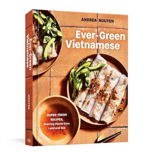
Shubhani playfully placed the book subtitle in the nước chấm dipping sauce bowl. For arty flair, the terracotta tiles wrap around the book’s spine (typically, the spine is a solid, different color). When I felt that the cover checked off my five cover functions, it was good to go.
Inside a Book Designer’s Brain
As the book cover design happened, I polished and proofed the book’s insides. I didn’t have a chance to thank Shubhani for her work until recently. When I did, I asked how she chose the steamed cauliflower rice rolls. Her response:
The Cauliflower-Shiitake Rice Roll image spoke to me for a number of reasons:
It was a simply styled and beautifully lit photo with the focus on the dish.
The background terra-cotta colour contrasted strikingly with the white of the rolls.
There was enough real-estate left over around the plates to place the title and ancillary type, with breathing room to spare.
Finally, and probably most importantly, the image had this effortless quality to it that spoke to the accessibility of the recipes in the book; while retaining a richness which reflected the cultural depth of the food writing.
As an excellent book designer (she’s worked on Dorie Greenspan’s books as well as Gwyneth Paltrow’s), Shubhani read my manuscript. She also considered my other book covers to ensure that Ever-Green Vietnamese would dovetail with them but not overlap (no pho or bánh mi on the cover!).

That’s how we made the cover of Ever-Green Vietnamese, which you may pre-order now. Because of the artwork and various design elements, producing cookbooks is complicated. It can be challenging but I liken it to building a beautiful, functional home or piece of furniture. Putting recipes, stories, and photos together into a useful, inspiring book that gets stained over years of usage is thrilling.
Have other questions about how my cookbooks get made? Leave a comment and I’ll provide another look under the hood!
P.S. Lunar New Year falls on January 22 so expect something from me roughly a week from today!
I would think: that looks so interesting and the combination of ingredients is really intriguing I have to make it NOW. Then I would be obsessed until I gathered the ingredients and made the dish.
I just wanted to say that I love your newsletter and it's honestly the only non-personal email I ever open and thoroughly enjoy reading. Your writing is so inviting and personal. Thank you.
The cookbook looks amazing. I pre-ordered the day you mentioned it and can't wait to get it.